- 2025
- Corporate website
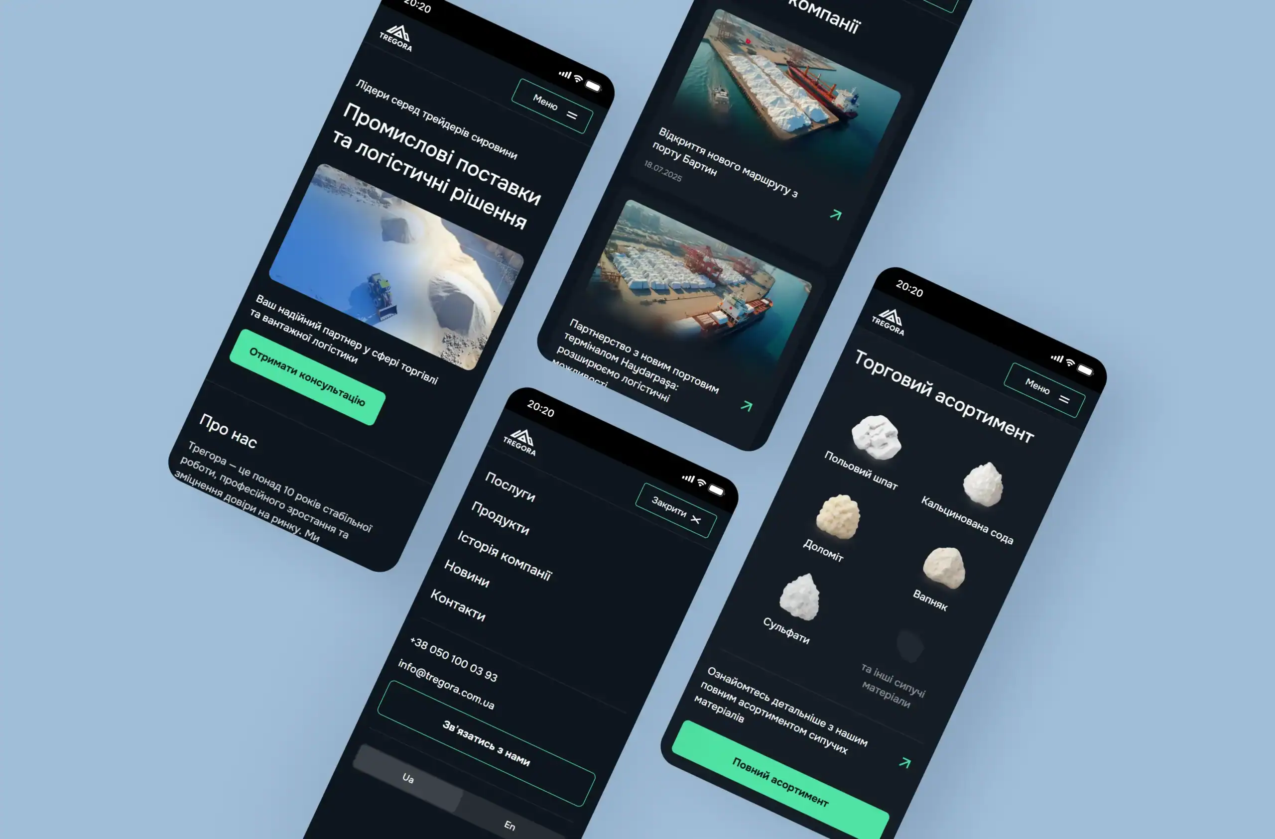
Tregora is a leader in the field of raw materials trading and logistics
23.12.2025
4 min
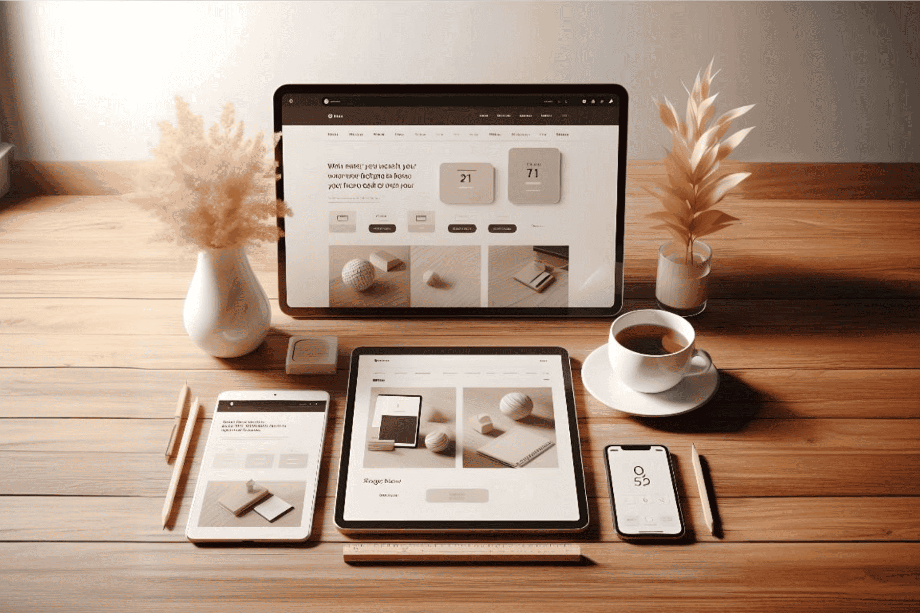
In today’s digital world, more and more users are accessing the Internet via mobile devices. According to research Statista, more than 50% of all traffic on the Internet comes from smartphones. This means that for web developers and entrepreneurs, responsive design has become not only desirable, but necessary.
Responsive design is an approach to web design that ensures the optimal display of a website on various devices and screens, from large monitors to small smartphones. This is achieved through the use of flexible grids, media queries and responsive images, which allows the site to adapt to the size of the user’s screen.
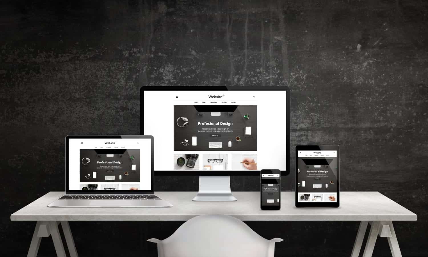
Responsive design provides a comfortable browsing experience regardless of whether the user is using a smartphone, tablet or computer. This means that all elements of the site, such as text, images and navigation, automatically adjust to the screen, making interaction with the site more convenient.
Google favours websites with responsive design in its search results. Responsive websites get higher search engine rankings because they provide a better experience for mobile users.
Instead of creating separate versions of a website for different devices (mobile and desktop), responsive design allows you to use a single template. This simplifies website maintenance and reduces development and update costs.
Research shows that user-friendly websites that are easy to browse on mobile devices have higher conversion rates. Users are more likely to make purchases and interact with content if the site is adapted to their device.
CSS media queries allow you to change the style of your website depending on the screen size. They help you control how content is displayed on different devices.

Images should automatically change their size depending on the width of the container they are in. This is achieved by using CSS properties such as max-width: 100%. You can also use different image formats for different screen sizes to improve performance.
Use images that automatically change their size depending on the device. This helps to avoid overloading the site with heavy files on mobile devices.

After creating a responsive design, it is important to test your website on different devices and browsers. Use tools such as Google Mobile-Friendly Test to check how well your website displays on mobile devices.
Responsive design is the key to success in the modern web space. It not only improves the user experience, but also improves SEO, saves resources, and increases conversions. Investing in responsive design is an investment in the success of your business in the mobile age. Don’t waste your time – make your website user-friendly for all users!
Our thoughts on business, marketing,
design, and website development.
Available for new challenges



Fill out the form