- 2025
- Corporate website
Tregora is a leader in the field of raw materials trading and logistics
09.07.2026

A website UX/UI audit is a systematic interface analysis that identifies barriers on the user’s path to completing a target action. It eliminates the root causes of low conversion rates on a B2B platform, allowing you to generate more leads from your current traffic without increasing the advertising budget. It is a tool for converting visitors into actual clients.
Business owners often face a paradoxical situation. Marketing works perfectly and contextual advertising drives thousands of visitors, but lead generation remains at zero. The sales team receives occasional calls, the cost per lead goes through the roof, and the ROI drops. In such cases, the problem rarely lies in the product quality or incorrect ad campaign settings.
Users click on a relevant link but encounter a confusing interface, complex navigation, or the lack of a clear value proposition. The modern B2B client will not waste time deciphering the convoluted structure of a corporate resource. If they do not find the necessary information within a few seconds, they simply close the tab and go to competitors. That is why website optimization is a critical step before scaling any advertising efforts.
The decision to collaborate in the corporate segment takes a long time and often requires the involvement of multiple stakeholders (from a marketer to a CEO). The Customer Journey here is never linear: weeks or months can pass from the first touchpoint to contract signing. If the website interface creates additional friction at any stage of this journey, you lose warm traffic. The answer to why there are no leads usually lies in the micro-conversions the user failed to complete due to a poor user experience.
A high bounce rate on landing pages is the first warning sign. Analytics show that a visitor entered, looked at one screen, and left. This means the visual communication failed, the content structure doesn’t meet the target audience’s expectations, or the site took too long to load.
Three main symptoms of an ineffective interface that destroy the sales funnel:
Each of these barriers breaks communication. Instead of smoothly guiding a potential partner to the lead form, the site forces them to overcome obstacles. In a competitive environment, clients choose business partners who are easiest to work with right from the first online interaction.
Most entrepreneurs mistakenly believe that design is exclusively about aesthetics, colors, and fonts. In reality, a UX/UI design audit is a profound analysis of business processes translated into a digital environment. It is a diagnostic tool that pinpoints exactly where the sales funnel breaks down and why the company is losing money during user interaction with the web resource.
The primary goal of such an analysis is not to revamp the visual style, but to eliminate the friction between the client’s desire to solve their problem and your offer. A professional usability audit relies on web analytics data, heatmaps, and the behavioral patterns of the target audience. Specialists study every step of the visitor, noting moments of hesitation, frustration, or misunderstanding of the interface logic.
The result of the audit is not merely a technical report, but a concrete plan for increasing ROI. Implementing the proposed changes allows you to convert existing traffic into actual deals. The business gains a clear understanding of which interface elements deter buyers, how to shorten the path to an order, and how much lost revenue can be recovered through targeted optimization.
User experience consists of micro-interactions. Sometimes a single mistake at a critical stage is enough to derail a lucrative contract. Let’s look at the most common touchpoints where B2B companies frequently lose potential clients due to a poorly developed interface.
The desire to collect maximum information about a potential partner right away works against your business. Forms with 10-15 fields scare away even highly interested customers. The target action on the website should be as simple and fast as possible: requesting a price, a basic consultation, or downloading a presentation. It is much cheaper to conduct additional lead qualification during a phone call than to force the user to fill out a detailed questionnaire.
The first few seconds on a page determine the user’s subsequent behavior. If the first screen is overloaded with abstract slogans instead of specifics, the visitor will not understand the essence of the offer. The B2B client is looking for an effective solution to a specific problem. The headline must instantly communicate what the company does, who it works for, and what specific business benefit it provides.
Corporate clients buy exclusively from reliable partners. If it is difficult to find a phone number, physical office address, or legal details on the website, the level of trust drops rapidly. Simply leaving a bare feedback form is not enough. It is necessary to provide a choice of communication channels and confirm your expertise through real certificates, partner reviews, or detailed case studies.
The specifics of the corporate segment often involve complex products with numerous configurations, conditions, and technical specifications. Poorly designed navigation forces the client to wander through dozens of pages in vain searches for pricing or documentation. The menu structure should reflect your buyer’s decision-making logic, not the internal department hierarchy of your company. Quick access to key data directly impacts the conversion rate.
There is a stereotype that corporate solutions are searched for exclusively from desktop computers during working hours. Modern analytics prove the opposite: executives and managers increasingly research contractor offers from their smartphones while on the go or during meetings. If the site is not adapted for mobile devices, the text merges, and control elements are unclickable, you are automatically handing over a paying audience to your competitors.
Attracting targeted corporate traffic is becoming more expensive every year. Competition in contextual advertising auctions drives up the cost per click, but endlessly increasing the marketing budget is impossible. This is exactly where a usability audit reveals its financial potential, allowing you to radically reduce the customer acquisition cost (CAC) without additional advertising spend. Instead of buying more expensive traffic, the business begins to process the existing flow of visitors more efficiently.
The mathematics of this process is linear and clearly shows how increasing B2B sales through interface optimization works. Let’s imagine a basic scenario: a company spends $2,000 to attract 1,000 targeted visitors. With a current conversion rate of 0.5%, the site generates only 5 leads, making the cost per lead (CAC) $400. If, after identifying and removing barriers, the conversion rate increases by just one percent to 1.5%, the company receives 15 leads for the same advertising budget.
In this case, the CAC instantly drops to $133. Reducing the cost per lead by three times frees up significant funds for further scaling or reinvesting in other sales channels. Correcting non-obvious errors in the logic of the resource provides a systemic effect: every subsequent marketing dollar starts generating a significantly higher ROI.
Theory is always better supported by real numbers and examples. In our practice, deep analysis and redesigning interaction logic always lead to measurable business results. Let’s look at how a well-thought-out user experience solves lead generation tasks in complex corporate niches.
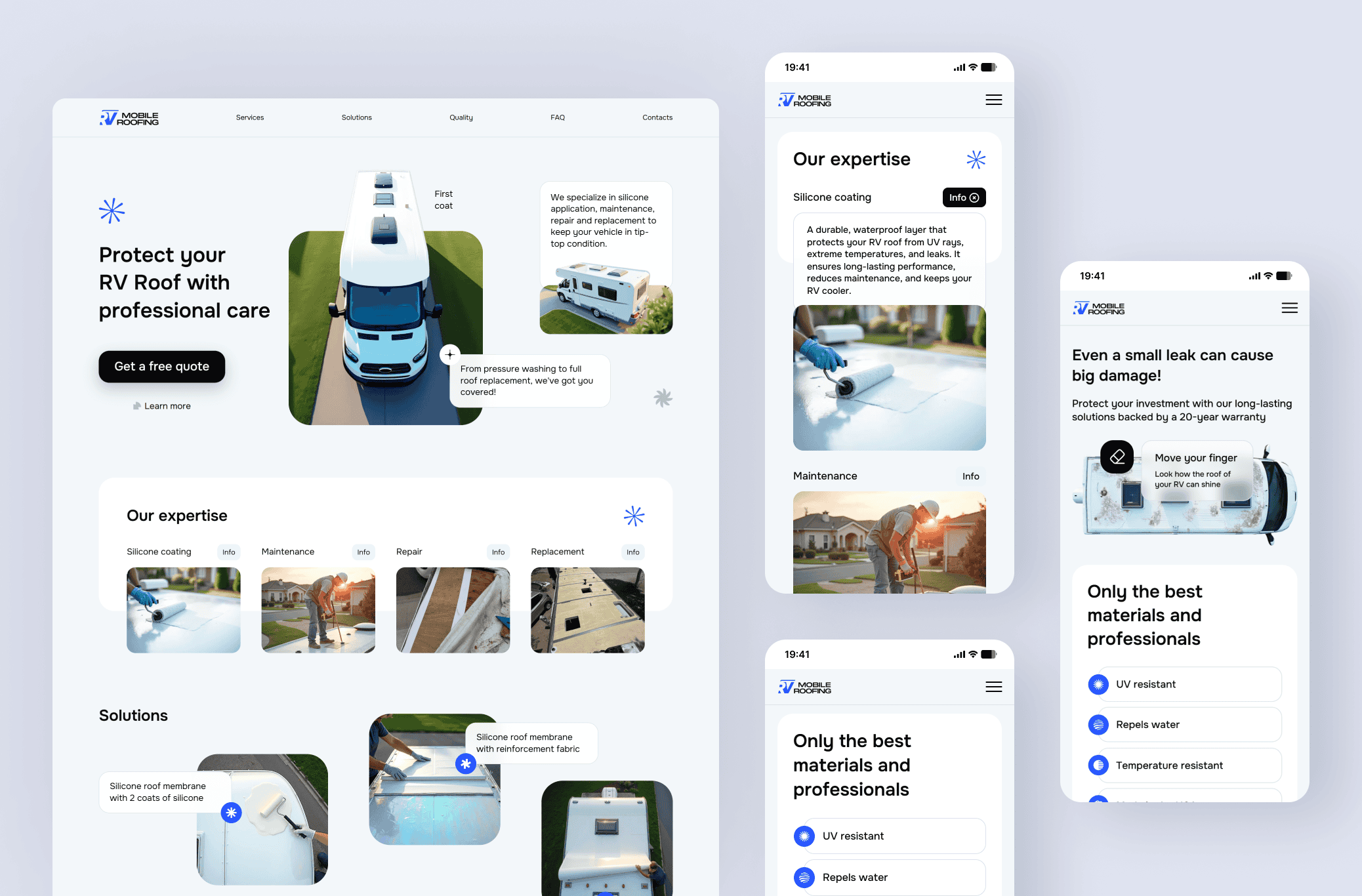
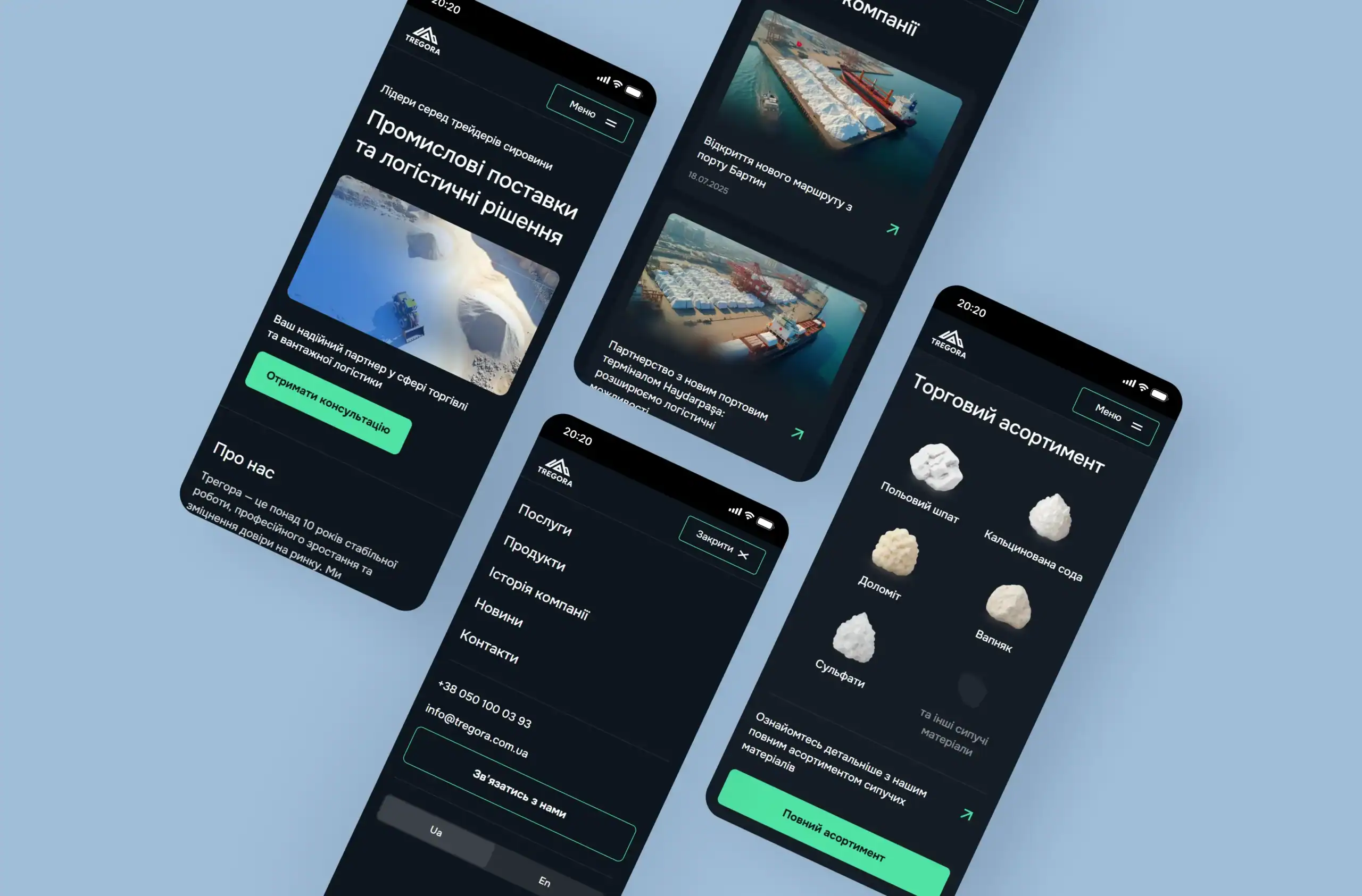
A prime example is our project for Tregora, a leader in raw materials trading and logistics. The task was to unify the company’s positioning as a full-cycle provider. During development, we completely rebuilt the content delivery structure. The services page was implemented as a separate landing page with interactive elements that encourage visitors to explore details and finalize their visit by submitting a request. Feedback forms were simplified to the bare minimum. This reduced the time spent on pre-sale communication and allowed the platform to generate high-quality B2B leads, transforming the company’s image from a simple supplier to a comprehensive partner.
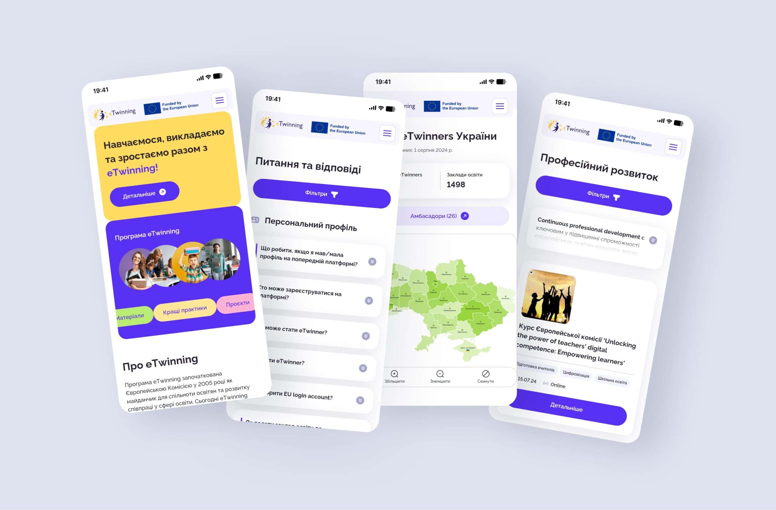
Another example is Zionmet, a metallurgical trading company operating in the EU and North American markets. Given the massive volume of material specifications and warehouse network data, organizing this information was the key challenge. The UX/UI website audit and subsequent development enabled the creation of concise navigation, where the client reaches the required technical data in a few clicks. Complex data sets were converted into an easy-to-understand infographic format, removing cognitive load from the user and focusing their attention on the target action.
Both projects prove the general rule of the corporate segment. When the interface speaks the client’s language, removes their objections, and creates no communication barriers, the lead conversion rate increases.
Scaling a non-working sales funnel only leads to a proportional increase in losses. A business should order a website audit if current metrics directly signal a breakdown in communication. The main triggers are a consistently high bounce rate on landing pages, low conversion despite relevant traffic, and an inflated cost per lead. Additionally, this analytical stage is mandatory insurance before launching large-scale advertising campaigns or planning a comprehensive redesign of an existing corporate resource.
A professional UX/UI design audit is not a set of abstract tips, but a deep diagnosis of the digital part of your business. The work of webCode.solutions specialists on such a project takes from 2 weeks, and the cost starts from 20,000 UAH ($500). During this time, the team fully immerses itself in your business model, studies the accumulated analytical data, and independently walks the path of a potential B2B client. The final result is a structured document with clearly prioritized technical and design fixes.
The company owner receives a transparent action plan: which critical interface errors must be fixed immediately to unblock sales, and which elements can be gradually improved during the support phase.
The modern competitive struggle for a paying B2B client requires flawless digital service at every stage of interaction. If a corporate web resource complicates the path to closing a deal, no additional marketing investments will provide the desired return on investment. Delegating the usability diagnostics task to a team of practitioners allows you to accurately pinpoint weaknesses and turn them into a tool for steady growth. Leave a request to substantively discuss the audit of your project and start converting existing traffic into actual contracts.
The main reason is the presence of user interface (UX/UI) barriers that complicate the path to the target action. This could be an overloaded request form with dozens of fields, confusing navigation for complex services, or the lack of a clear value proposition on the first screen.
A design audit allows you to identify and eliminate obstacles that prevent targeted visitors from becoming your clients. Implementing the analysis results directly increases the web resource’s conversion rate, boosts the number of leads, and drastically reduces the customer acquisition cost (CAC) without additional advertising spend.
A professional UX/UI audit of a corporate website at webCode.solutions costs from 20,000 UAH (from $500). A detailed analysis of the interface, behavioral factors, and business logic of the resource, along with report generation, takes from 2 weeks.
The investment pays off within the first few months after implementing the proposed changes, thanks to a steady increase in the conversion rate. Boosting this metric by even 1-2% frees up a significant marketing budget, as you start securing more actual deals from the same volume of traffic.
Our thoughts on business, marketing,
design, and website development.
Available for new challenges



Fill out the form