- 2025
- Corporate website
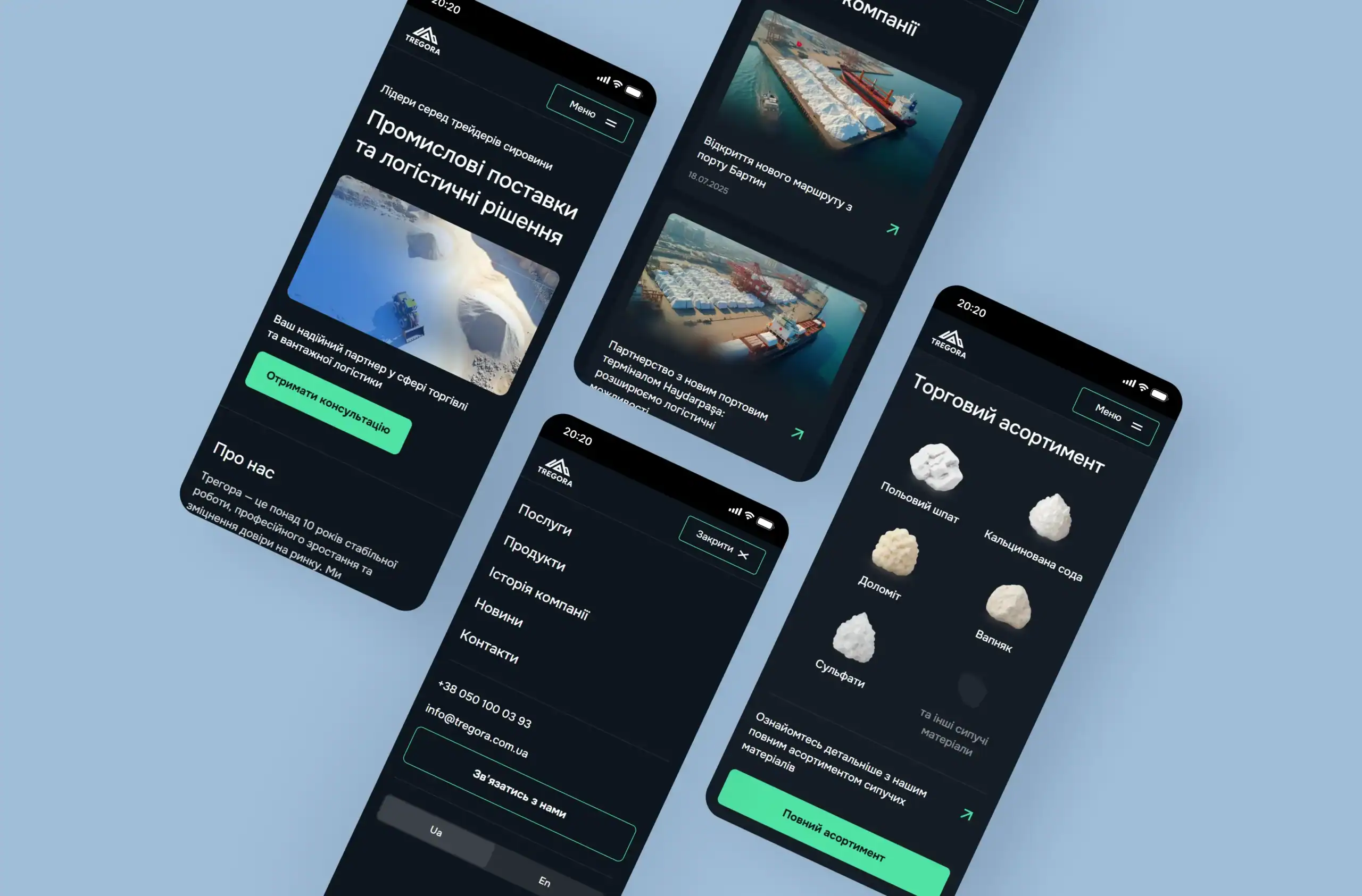
Tregora is a leader in the field of raw materials trading and logistics
19.04.2026
11 min

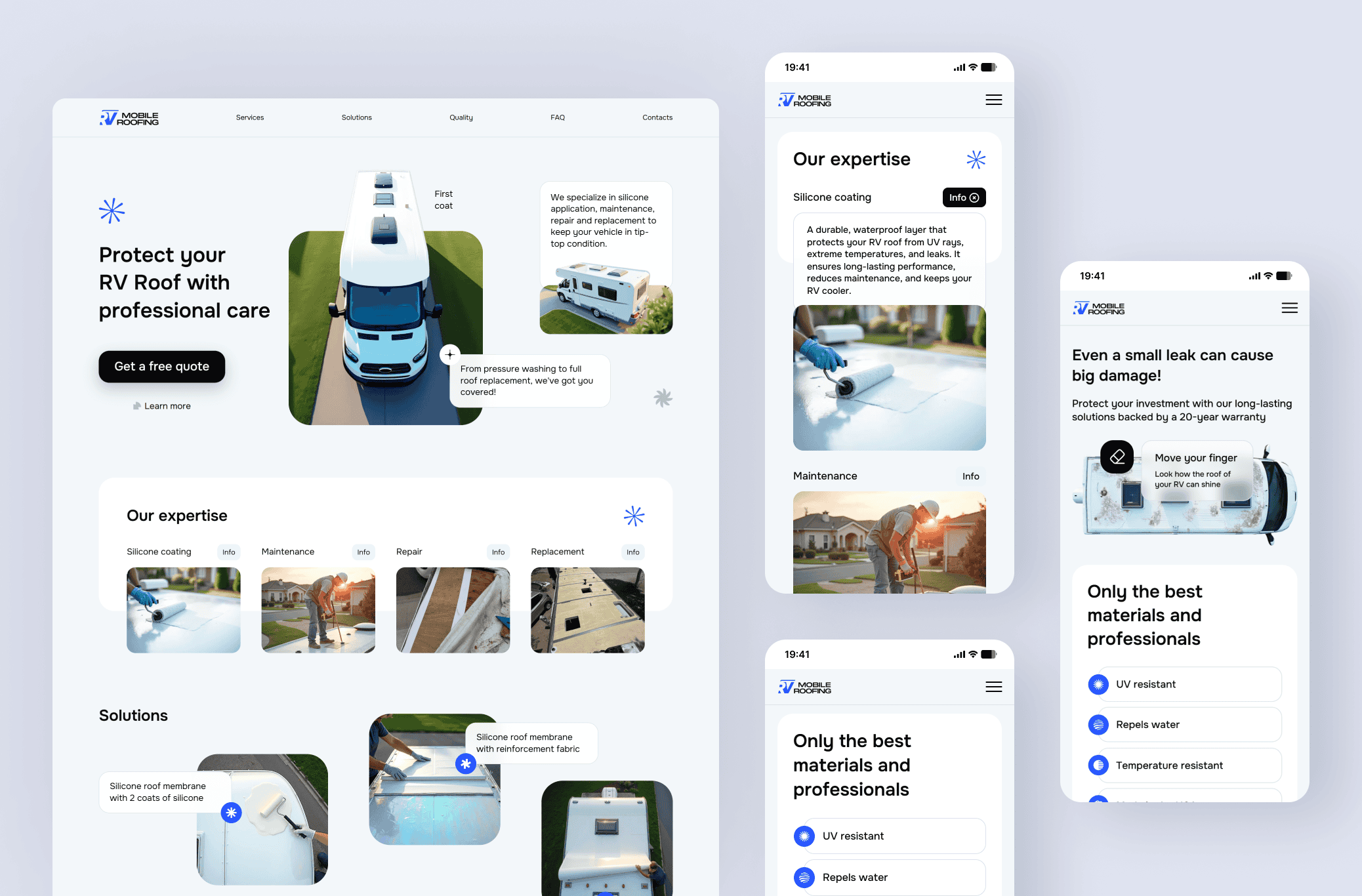
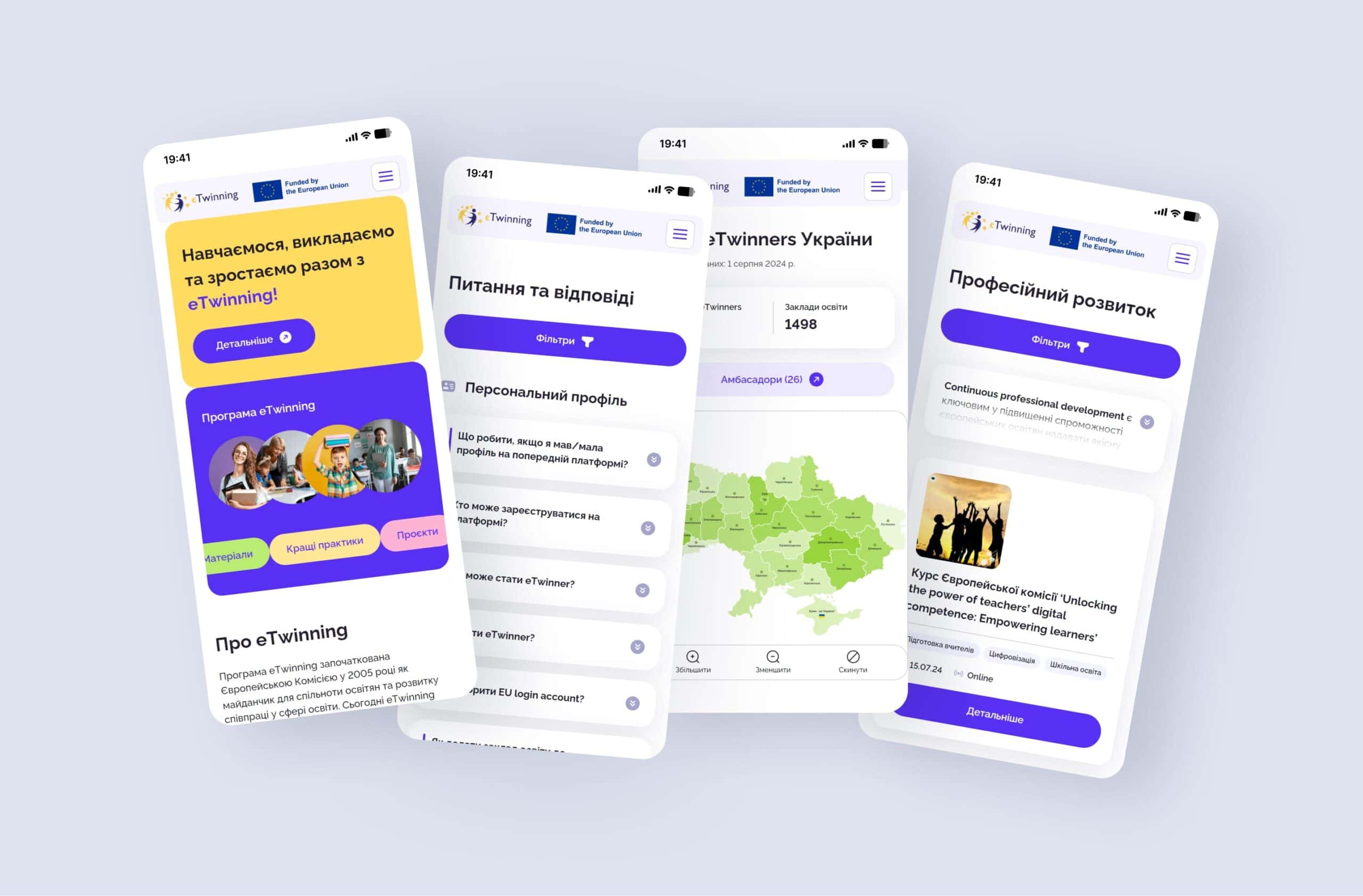
Adaptive website design is a development technology that ensures pages are displayed correctly on any device. For businesses, this means a consistently high conversion rate regardless of the user’s gadget. Instead of creating separate versions, adaptive design uses a single codebase, which speeds up technical support and improves SEO performance through Google’s Mobile-First Indexing.
Responsive website design has long ceased to be an additional option and has become a basic requirement for business survival online. Today, more than 70% of target traffic comes from smartphones, with the mobile audience often being the most solvent. These are people who make purchasing decisions on the go, order services during breaks, or choose contractors through mobile apps and browsers. If your website is not displayed correctly on an iPhone or Android device, you lose leads at the moment when they are most ready to complete a transaction.
For a business owner, adaptability is primarily about maintaining a stable conversion rate (CR). When the interface adjusts to the screen resolution, users do not waste time zooming in on text or searching for contact buttons. At webCode.solutions, we view UI/UX design not as a visual shell, but as a tool for converting visitors into customers. The lack of responsive design creates technical barriers that force potential clients to turn to competitors whose websites work flawlessly.
Investment in responsive website layout design pays off by reducing customer acquisition cost (CAC). When the same page works effectively for both desktop and smartphone users, you get the maximum return from every advertising dollar. The business gains a single point for collecting analytics, which allows it to track the customer journey more accurately and optimize marketing strategies based on real data about user behavior.
Google has been using Mobile-First Indexing as its main ranking principle for several years. This means that the search crawler evaluates your website based specifically on its mobile version. Even if the desktop version looks perfect, poor mobile website optimization will lead to lower positions in overall search results. For businesses, this creates a direct threat to brand visibility and a loss of organic traffic, which remains the most cost-effective acquisition channel.
Behavioral factors, such as time on page and bounce rate, directly depend on how convenient the website is to use from a smartphone. If users face overlapping elements or fonts that are too small, they close the tab within the first three seconds. A high bounce rate signals to search engines that the resource is of low quality, which negatively affects SEO promotion and the overall authority of the domain.
Implementing adaptability in every webCode.solutions project guarantees that the technical side of the website meets current Google algorithms. We focus on making content load instantly while keeping the structure logical on any screen. This approach ensures a long-term advantage in search results, allowing your business to attract customers without constantly increasing budgets for paid search advertising.
The convenience of a smartphone interface directly correlates with the level of trust in a brand. When a CEO or client opens a website from a mobile device, they expect instant access to key information: contact buttons, pricing, or a catalog. If elements are too small or overlap with each other, cognitive load increases, forcing the user to close the page. High-quality UX/UI design for business eliminates these barriers, making the customer journey from the first click to placing an order as seamless as possible.
A high bounce rate on mobile devices often indicates usability issues rather than an unappealing offer. Smartphone users usually act under time constraints, so the website architecture must take the “thumb rule” into account. We place all interactive elements so that they are easy to reach with one hand. This significantly increases audience retention and encourages repeat visits, as a positive user experience builds loyalty.
At webCode.solutions, we pay special attention to content readability without the need for horizontal scrolling or zooming. Responsive typography, optimized contact forms, and simplified navigation are not just visual improvements. They are tools that directly influence financial results, turning passive mobile traffic into an active customer base. Every interface element works to ensure that users feel your company’s expertise and reliability from the very first second of loading.
From a business strategy perspective, responsive layout is the most cost-effective solution for long-term scaling. In the past, companies often created separate mobile versions on subdomains, such as m.site.com, but today this approach only doubles the cost of maintaining and updating content. Adaptive design allows you to manage a single resource, significantly reducing time-to-market when launching new services or products. You make changes once, and they are instantly reflected across all devices.
The ROI of responsive design becomes evident through the absence of a need to duplicate SEO work and marketing activities. A single URL for all devices simplifies indexing and helps avoid duplicate content issues that often occur with mobile versions. Below is a comparison that demonstrates the advantages of responsive design for a company’s budget:
| Comparison Parameter | Adaptive Design (Responsive) | Separate Mobile Version |
| Maintenance Cost | Low — one admin panel and codebase | High — two independent systems |
| SEO Efficiency | Maximum — unified domain authority | Link equity is distributed across versions |
| Update Speed | Instant updates across all devices | Changes need to be applied twice |
| User Experience | Stable and consistent brand experience | Possible differences in functionality |
By choosing an adaptive solution, you invest in a foundation that will not require redevelopment in a year. Technical support for such a website is simpler and more cost-effective, as developers do not need to fix bugs on two different platforms at the same time. For startups and growing businesses, this is an opportunity to direct saved resources toward product development rather than fighting the technical debt of outdated solutions.
Your client may open your website from the latest iPhone model, a Windows work laptop, or a budget tablet. Cross-browser compatibility ensures that in each of these cases, the interface will work with the same level of stability. Technical issues, such as a broken layout in Safari or non-functional forms in Chrome, are perceived by users as a sign of the company’s incompetence. A business loses revenue not because of a poor product, but because users cannot order it from a specific device.
Loading speed is a critical factor that directly affects search engine rankings and customer satisfaction. A responsive layout allows resource loading to be optimized: lighter versions of images are displayed on mobile devices, saving traffic and speeding up page rendering. Every second of delay reduces conversion by 7–10%, so technical optimization for different types of devices is a direct investment in revenue growth.
In our work, we use the principle of a “flexible grid,” which allows elements to dynamically change their size and position. This eliminates the need to develop separate scenarios for every new gadget that appears on the market. As a result, your resource remains relevant for years without requiring costly reprogramming for new screen resolution standards. You receive a product that is ready for the challenges of the future, significantly increasing the long-term ROI of the project.
For our team, creating a website without proper responsive design means delivering a product that is flawed from the start. We do not offer mobile optimization as an additional paid service because we understand that in 2026, a business cannot exist without a high-quality mobile presence. Every project that goes through website development at webCode.solutions includes in-depth work on user behavior scenarios across smartphones and tablets by default.
We conduct thorough testing on real devices, not just in browser emulators. This allows us to identify and eliminate issues with button taps, font readability, and interface response speed before launch. This approach ensures that after the project is handed over to the client, the website can immediately start generating leads instead of requiring endless revisions due to customer complaints. Our technical support focuses on developing functionality rather than fixing basic display errors.
Professional implementation of responsive design allows a business to remain flexible. You can confidently launch advertising campaigns on Facebook, Instagram, or Google Ads, knowing that every click from a mobile ad will lead to a target action. We create an architecture that helps your brand look solid and modern in the eyes of a solvent audience, regardless of where and how they found your resource.
Responsive website layout design is not a matter of aesthetics, but a matter of economic feasibility and market competitiveness. Ignoring mobile users today is equivalent to voluntarily giving up the larger share of the market. Creating a single, flexible, and fast resource allows a company to focus on what matters most: sales, marketing, and service improvement, without being distracted by the technical limitations of outdated systems.
High-quality optimization for different types of devices ensures a high level of trust, improves SEO positions, and maximizes the return on marketing budgets. If you want your website to become a real sales tool rather than just a digital business card, it is worth entrusting its development to professionals who understand the value of every second of loading time and every user click.
Delegating development to experts allows you to receive a technologically polished product that will work for your brand 24/7. We are ready to turn your business goals into an effective digital solution with guaranteed quality in every element.
Responsive design is the priority choice for modern businesses because it uses a single URL and codebase, which significantly simplifies SEO promotion and technical support. Unlike mobile versions on subdomains, adaptive design automatically adjusts to any screen resolution, ensuring a consistent brand experience and higher ROI.
Yes, this is a critical requirement due to Google’s Mobile-First Indexing, where the mobile version of a website is the primary version used for indexing and determining rankings in search results. Websites without proper mobile optimization risk lower search rankings, which can lead to a loss of organic traffic and increased customer acquisition costs.
Professionally implemented responsive design uses optimized media queries and lightweight image versions that load depending on the technical characteristics of the device. This minimizes waiting time for mobile users, improves behavioral factors, and stimulates conversion rate growth.
At webCode.solutions, responsive design is an essential quality standard, which is why it is included by default in the cost of every project we develop. We do not treat mobile optimization as a separate service. Instead, we provide businesses with a complete sales tool that works seamlessly across all types of devices, without hidden fees.
Our thoughts on business, marketing,
design, and website development.



Fill out the form